 Image
Image
Yellow and Violet : An artist's impression of the colours that stand poles apart
A graphic designer, owner of Graphite Studio and Artistic Director, Janus White Cube, Subhamay Basu, talks about how his reconciliation with the colours yellow and purple.
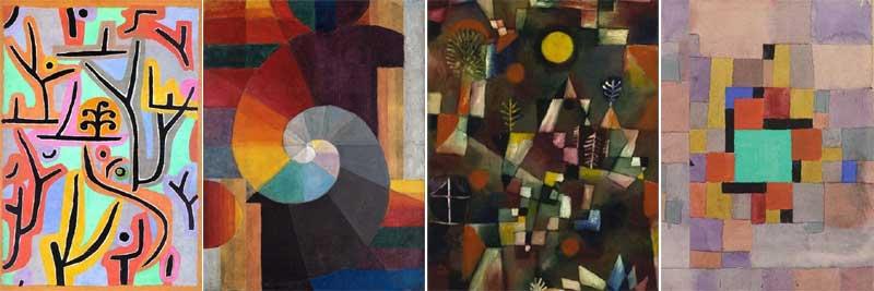
In his Theory of Colour, Paul Klee writes about the importance of using complementary colours and balancing each other out.
He argued that yellow and violet are the two most different colours of the spectrum, and integrating the fiery yellow and rich purple tones is a rather difficult task.
These two are almost stubborn and the hardest to reconcile with each other.
Yet, we find them happily dancing, in some of the greatest works of art.
Klee, for one, made it look almost easy.
I am a self-taught artist, and as far as I can remember, I have been fascinated by colours.
Those were also the days when only the six or twelve colour paint boxes were available in the neighbourhood stationary store.
This actually made me spend hours playing with these limited colours and mixing one with other to make a new colour, which nobody else has.
I still remember my joy and wonder when I once mixed lemon yellow and cobalt blue to create a gorgeous shade of green.
But, apart from a couple of incidents like this, I could never get around yellow and purple together.
After years of disappointment, they began to scare me.
Was it too much or too insignificant, was it looking frivolous – all these doubts kept bothering me and I started avoiding two of my favourite colours for years.
Years went by, I grew up; had my share of losses, heartbreaks, explorations, conquests, introspection and regrets.
Meanwhile, I came to know that I have a bi-polar personality.
I was given some exercises with which I would gradually learn how to overpower anything which kept me from actualizing my potentials and leading a fulfilled life.
This was also the time when, along with practice, I started to read about artistes and art movements, and was magnetically drawn towards Expressionism.
I became almost obsessed with Paul Klee; read up on his life and the rules he taught in the Bauhaus School.
Klee’s sixth rule was to “know your colour wheel”.
He went on to write a whole theory on his Pedagogical Sketchbook.
And there they were again! Yellow and Purple!
He explained how adamant the colours were and then beautifully married them in his works.
Yellow and purple face each other directly on the colour wheel, like two opposing poles.
Poles – and there it was!
Yellow and purple were two sides of me as well!
One reflects, the other absorbs; one is the Sun, the other, clouds; one can blind with brightness, the other can invoke a deep and hidden pain.
They signify each other without the need of definition.
And without their balance, the wheel cannot turn.
I cannot claim to have tamed them, I doubt if I ever will. But, they don’t scare me anymore.
For me, it was a personal milestone.
Top Headlines
-
Art and Culture
New Sheriff Goutam Ghose to unlock Kolkata's buried colonial past records untouched since the East India Company
April 08, 2026
-
Art and Culture
Beloved Timekeepers: From Kolkatas New Market Clock to Icons Around the World
March 26, 2026
-
Art and Culture
Sacred Waters, Shared Faith: Panchu Dola Melana Lights Up Odishas Chilika Lake
March 16, 2026
-
Art and Culture
Rich tribute to Bhupen Hazarika at Kolkata Book Fair marks birth centenary
January 29, 2026
-
Art and Culture
Kolkata Vistiwalas: The Last Bearers of Water
January 16, 2026
-
Art and Culture
Beyond Old and New: Bickram Ghosh and the Art of Fusion at Serendipity
December 25, 2025
-
Art and Culture
Saptak Music School of Pittsburgh hosts spellbinding evening of Indian classical music
September 23, 2025
-
Art and Culture
Zigzag to clarity: Sonal Mansinghs dance of life captivates Delhi
September 08, 2025
-
Art and Culture
USA: Santoor Ashram Kolkata mesmerises Los Angeles with a celebration of Indian classical music
August 27, 2025
-
Art and Culture
'Feels like a tonic in my musical pursuits': Flute virtuoso Pandit Ronu Majumdar receives Padma Shri
June 06, 2025

